 | Using the Nimbus Driver Designer |
The Nimbus user interface is completely integrated with the Visual Studio IDE. Nimbus offers a variety of tool windows, document windows, menus, and commands for manipulating every aspect of the driver project. Driver developers can quickly navigate between Nimbus-supplied commands and windows and native Visual Studio windows with which they are already familiar, such as code editors and Solution Explorer. This topic presents an overview of the Nimbus user interface within Visual Studio and introduces UI terminology used throughout the Nimbus documentation.
 Note Note |
|---|
The images presented in this topic show the user interface elements for an IVI.NET driver with a linked IVI-C driver. However, the same user interface elements exist for IVI-COM and stand-alone IVI-C drivers. The IVI.NET user interface is presented here for illustration purposes. |
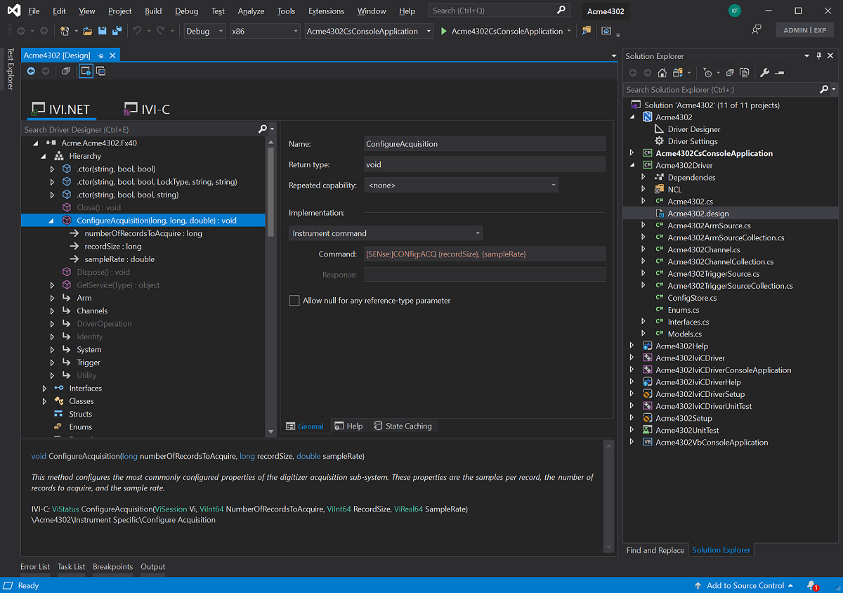
The image below shows an example of a Nimbus IVI.NET driver project in Visual Studio. Each of the Nimbus-supplied items are labeled and discussed in the sections below.
 Solution Explorer and the Nimbus Project
A Nimbus driver solution is simply a container for the Nimbus driver project and all of its supporting projects -- such as the unit test project, the help project, and the setup project. As with any Visual Studio solution, a Nimbus driver solution is managed from the Solution Explorer window shown on the right side of Figure 1. The node that appears at the top of Solution Explorer is the referred to as the Nimbus node -- (the node with the Nimbus icon). It is used to access project-wide features. For instance, the Driver Designer and the Driver Settings Editor are accessed by right-clicking the Nimbus node and choosing from the context menu, or by expanding the Nimbus node and double-clicking one of its child nodes.
The projects that appear in Solution Explorer beneath the Nimbus node are Nimbus Driver Help, Nimbus Driver Setup, and standard unit test project types. Though Nimbus automatically generates and manages much of the code in these projects, they can be accessed just as typical Visual Studio projects.
The Driver DesignerMost of the tasks involved in IVI driver developer are performed within a special document window -- the Driver Designer. The image in Figure 1 shows how the Driver Designer appears as a tabbed document window alongside other Visual Studio document windows -- such as code editor windows and project property pages. This makes it easy to move between the Driver Designer and other areas within the IDE.
The Driver Designer can be accessed from Solution Explorer by double-clicking the Driver Designer node. The designer is divided into three regions -- a tree view that occupies the left portion of the window, an Item Editor in the right portion of the window, and a yellow Info Panel appearing along the bottom of the window.
The Tree View
The tree view is used to navigate the hierarchy of types, methods and properties in the driver. Right-clicking the various nodes in the tree, reveals context menu commands for performing the most common Nimbus tasks, such as adding methods, properties, and parameters. The tree fully supports standard copy/paste functionality as well as drag and drop for quickly arranging the driver hierarchy as desired.
The Item Editors
The right portion of the Driver Designer window is occupied by a series of Item Editors. The Item editors are used to manipulate various aspects of the method, property, parameter or other item selected in the tree view. In Figure 1, a property is selected -- making five different Item Editors available via the row of five buttons along the bottom. These are labeled "General", "Help", "Simulation", "Range Checking", and "State Caching".
The Info Panel
The bottom portion of the Driver Designer window is occupied by a yellow window called the Info Panel. This read-only window provides useful "at-a-glance" summary information about the item selected in the tree view. For instance, when a method is selected in the tree view, the Info Panel displays the full signature of the method or property. In addition, the help summary information for the method or property is display.
If a method or property uses a type that also exists in the tree view, such as enums or interfaces defiend by the driver itself, then the Info Panel displays that type as a hyperlink. Clicking the hyperlink navigates to the type where details about the specific type can be reviewed.
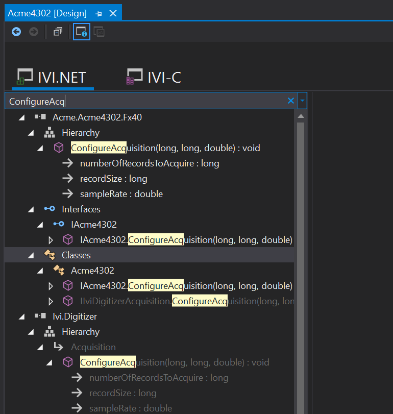
Searching and Filtering
The Driver Designer window provides a standard Visual Studio search box for searching and filtering the items displayed in the tree view. This search box works similarly to the standard search box integrated into Solution Explorer.
You can quickly navigate to the search box by typing CTRL+E. The image below shows the results of typing a few characters into the search box.
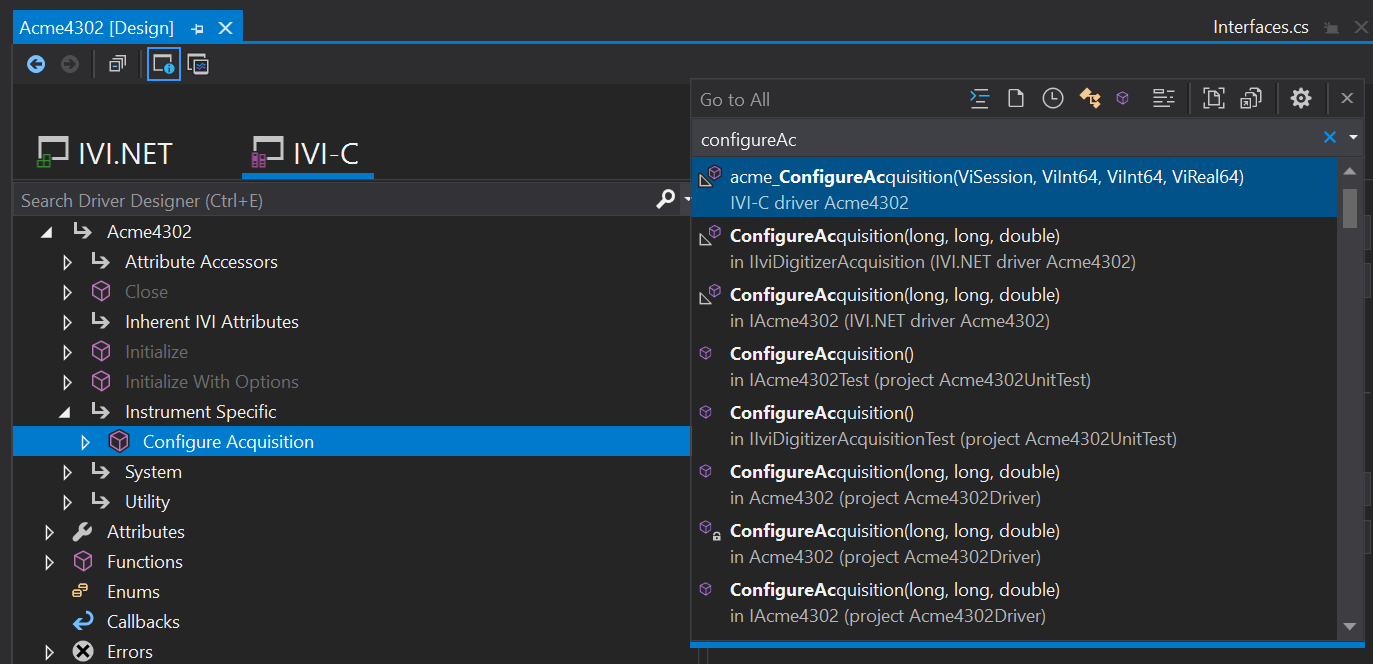
Quick Navigation
Visual Studio includes a feature called Go To All that allows quick navigation to specific elements in a solution. By typing CTRL+, or CTRL+t, users have access to the Go To All dialog from which they can very quickly navigate to specifci files, methods, classes, and more.
Nimbus integrates directly with this feature of Visual Studio to extend the set of items users can quickly access. Within the Go To All dialog, typing part of driver method or property name, for example, presents options for navigating directly to the item in the Nimbus Driver Designer.
Keyboard Navigation and Tabbing
When keyboard focus in on an item in the Driver Designer tree view, tabbing proceeds as follows:
- Grid splitter
The first tab operation places focus on the grid splitter. When focus is on the grid splitter, the left and right arrow keys can be used to move the splitter left and right -- effectively changing the amount of space allocated to the tree view relative to the item editors.
- Item Editor Tab
The next tab operation places focus on the item editor tab, usually the General tab. The focus visual (a dotted rectangle) appears around the tab that has keyboard focus. Use the left and right arrow keys to select different item editor tabs, such as moving to the Help or State Caching tabs.
- Item Editor Controls
The next tab operation places focus on the first control within a specific item editor. This is often then Name text box, such as the name of a method or property. Successive tab operations move to the next control in the item editor.
TipAt any point after tabbing away from the tree control, use CTRL+SHIFT+LEFT ARROW to navigate directly back to the associated tree item. This makes it very convenient to edit one control in the item editor and then return to the tree view and move to another tree view item.